Adding an app theme selector with TailwindCSS

August 20, 2022

Recently I wanted to add theming support to one of my side projects and I shared about it on Twitter and had someone ask to make a post sometime. Matt Swanson wrote more about this on BoringRails, and that's originally how I got the idea to do this, so thanks Matt! 

Just as a standard disclaimer, there are many ways you can add theming support and this is just one way I’ve done so, I hope it gives you some ideas for your next project.

What are we building?

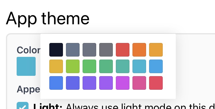
This is the end result, in this case I’ve chosen to use a preset-list of primary colors from TailwindCSS’s coloring because I think they look nice for my use-case.

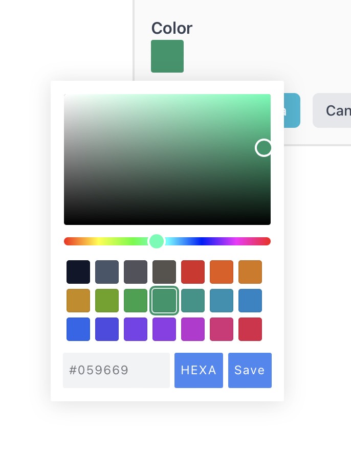
To start I chose a color picker for my project, I picked this one even though it’s no longer having new features added because it works well with TailwindCSS, allows me to set Swatches of colors to pick from and allowed me to customize much of it.

You might want to look at another package if that isn’t within your tolerance for your project like some React color picker or similar. Since I’m keeping my frontend light with just Stimulus when needed this works okay for my needs.
yarn add @simonwep/pickr
I’m using this color picker in another place in my app, but have more of the configuration options turned on still, so a user can select their color with a picker instead of just a color swatch selector.


We’ll come back and implement the color picker, but first we need to add a column to our database so we can store the color preferences for our users. As a note, I’ve decided to store my chosen colors as HEX codes, but you can use RGB, RGBA or whatever else you’d like. You’d need to update the tailwind.config.js file to reference them with the format for css however. Matt Swanson wrote more about this on BoringRails.
Generating the fields to store the theme options
rails generate migration AddThemeSettingsToUser
Now we can update this file to look like so
class AddThemeSettingsToUser < ActiveRecord::Migration[7.0]
  def change
    add_column(:users, :theme_settings, :jsonb, default: {})
  end
end
I'm using a jsonb column because with Postgres and Rails it's super powerful to add new 'columns' at will.
Next I want to add a gem called store_attribute to my application to help set some defaults for new users when they sign up for our app.
bundle add store_attribute
Now in our User model let's reference the new gem's column store.
  store_attribute :theme_settings, :primary_color, :string, default: "#22c55e" # bg-green-500
  store_attribute :theme_settings, :primary_color_hover, :string, default: "#15803d" # bg-green-700

I’m using two primary settings here, a `primary_color` and `primary_color_hover` setting. You may need more depending on your application, but this works for me.

Then in my layout I render a `shared/colors` partial inside a 
<style type="text/css">
  :root {
    --color-primary: <%= Current.user&.primary_color || "#22c55e" %> ;
    --color-primary-hover: <%= Current.user&.primary_color_hover || "#15803d" %>;
  }
</style>
This sets the CSS Variables into the root pseudoselector.

The next step in our process is telling TailwindCSS to create two custom colors we can use throughout our application / styles.

Inside of my tailwind.config.js file I added the theme.
  theme: {
    extend: {
      colors: {
        primary: 'var(--color-primary)',
        'primary-hover': 'var(--color-primary-hover)',
      }
    }
Now with that, Tailwind will generate us `bg-primary` `text-primary` `border-primary` etc and primary-hover variants we can use throughout our application.


Setting and saving the columns on the User

Somewhere in your app you'll need a field for the user to select and send the primary_color and primary_color_hover option to the backend. I'll leave that exercise up to the reader, but be sure to permit those params on the backend. For example here's my Settings::ThemesController
module Settings
  class ThemesController < ApplicationController
    def edit
    end

    def update
      if Current.user.update(user_params)
        respond_to do |format|
          format.html { redirect_to edit_settings_theme_path, notice: "Theme updated" }
          format.turbo_stream { flash.now[:notice] = "Theme updated" }
        end
      else
        render :edit, status: :unprocessable_entity
      end
    end

    private

    def user_params
      params.require(:user).permit(:primary_color, :primary_color_hover)
    end
  end
end
Next in settings/themes/edit.html.erb I create two hidden fields, one for my primary color, and the second for the primary color hover, we'll use the div with the data-primary-theme-color-target="picker" to actually show which main color the user selects.


<%= form_with(model: Current.user, url: settings_theme_path, method: :PATCH) do |form| %>
      <%= form.label :color, for: :primary_color %>
      
      <%= form.hidden_field :primary_color,
        placeholder: "#efefef",
        value: form.object.primary_color,
        data: { primary_theme_color_target: "input" }
      %>
      <%= form.hidden_field :primary_color_hover,
        value: form.object.primary_color_hover,
        data: { primary_theme_color_target: "hoverInput" }
      %>
      
      <%= form.submit %>
<% end %>

Let's create that Stimulus Controller. 
rails generate stimulus primaryColorTheme
Now you can open primary_color_theme_controller.js and start adding our code. Let's start by importing our package we're using and then making an initialize method that will initialize the color picker.
import Pickr from "@simonwep/pickr";

export default class extends Controller {
  static targets = ["picker", "input", "hoverInput"]

  initialize() {
    this.initPicker();
  }
}

Now inside of the controller we can define our initPicker function
initPicker() {
    this.picker = Pickr.create({
      el: this.pickerTarget,
      theme: "monolith",
      default: this.inputTarget.value,
      defaultRepresentation: "HEX",
      inline: false,
      showAlways: false,
      position: "right-middle",

      swatches: [
        // all colors use -500 variants from tailwind colors
        "#0f172a", // slate-900
        "#64748b", // slate
        "#6b7280", // gray
        "#71717a", // zinc
        "#ef4444", // red
        "#f97316", // orange
        "#f59e0b", // amber
        "#eab308", // yellow
        "#84cc16", // lime
        "#22c55e", // green
        "#10b981", // emerald
        "#14b8a6", // teal
        "#06b6d4", // cyan
        "#0ea5e9", // sky
        "#3b82f6", // blue
        "#6366f1", // indigo
        "#8b5cf6", // violet
        "#a855f7", // purple
        "#d946ef", // fuschia
        "#ec4899", // pink
        "#f43f5e", // rose
    ],

      components: {
        preview: false,
        opacity: false,
        hue: false,
        interaction: {
          hex: false,
          rgba: false,
          hsla: false,
          hsva: false,
          cmyk: false,
          input: false,
          clear: false,
          save: false,
        },
      },
    });

    this.picker.on('swatchselect', (color, instance) => {
      this.inputTarget.value = color.toHEXA().toString();
      document.documentElement.style.setProperty("--color-primary", color.toHEXA().toString())
      // more to come
      instance.applyColor();
      this.picker.hide();
    });
  }

So we've got a basic picker here that's setting our primary color from a list of Swatches of colors that I picked from Tailwind's colors since they're pretty.

But what about the primary color hover? We created a hidden form for that so we probably want to set it up so that when we pick say the green swatch, we set the value to be green-700 for the hover color.

In my case I wanted to manually set the hover color so users couldn't select a hover color that made things look bad, so I'll make a object I map the primary color to what the hover color should be for it.

Inside our stimulus controller
  hoverColorForPrimaryColor(primaryColor) {
    return {
        "#0f172a": "#334155", // slate-900, slate-700
        "#64748b": "#334155", // slate-500, slate-700
        "#6b7280": "#374151", // gray-500, gray-700
        "#71717a": "#3f3f46", // zinc-500, zinc-700
        "#ef4444": "#b91c1c", // red-500, red-700
        "#f97316": "#c2410c", // orange-500, orange-700
        "#f59e0b": "#b45309", // amber-500, amber-700
        "#eab308": "#a16207", // yellow-500, yellow-700
        "#84cc16": "#4d7c0f", // lime-500, lime-700
        "#22c55e": "#15803d", // green-500, green-700
        "#10b981": "#047857", // emerald-500, emerald-700
        "#14b8a6": "#0f766e", // teal-500, teal-700
        "#06b6d4": "#0e7490", // cyan-500, cyan-700
        "#0ea5e9": "#0369a1", // sky-500, sky-700
        "#3b82f6": "#1d4ed8", // blue-500, blue-700
        "#6366f1": "#4338ca", // indigo-500, indigo-700
        "#8b5cf6": "#6d28d9", // violet-500, violet-700
        "#a855f7": "#7e22ce", // purple-500, purple-700
        "#d946ef": "#a21caf", // fuschia-500, fuschia-700
        "#ec4899": "#be185d", // pink-500, pink-700
        "#f43f5e": "#be123c", // rose-500, rose-700
    }[primaryColor.toLowerCase()]
  }
Now we can use this value inside the swatchselect event in our initPicker function.
    this.picker.on('swatchselect', (color, instance) => {
      this.inputTarget.value = color.toHEXA().toString();
      document.documentElement.style.setProperty("--color-primary", color.toHEXA().toString())

      var hoverColor = this.hoverColorForPrimaryColor(color.toHEXA().toString());
      this.hoverInputTarget.value = hoverColor;
      document.documentElement.style.setProperty("--color-primary-hover", hoverColor)

      instance.applyColor();
      this.picker.hide();
    });
That's it for the most part! I hope this post helps you to add a theme functionality to your app!

I'd love to hear your thoughts on my Twitter if you have any ideas on improvements!

- Andrea